DISCHARGE: The Untold Story Behind Their Iconic Minimalist Aesthetic

Discharge. Their influence and importance can't be overstated, and they remain the ultimate band for so many fans of the hardcore genre. They've been dissected and imitated, emulated and appropriated, plus everything in between. The Discharge aesthetic is a style that is as important to the overall image of the band as their brand of raw hardcore itself. But the story behind the iconic graphic imagery of the band and how they came to develop their high contrast black and white aesthetic has largely never been told.
The sleeve design of the early EPs has defined the look of Discharge. Each one is credited seemingly indiscreetly for all to see: "Realities Of War" reads "sleeve design: Martin H.", "Fight Back" has "Sleeve, M.H.", and "Decontrol" states "sleeve Martin H.". Yet the largely anonymous Martin H. is rarely mentioned in Discharge lore. And after those EPs, there's no sleeve credits, no mention of the mysterious Martin H., and no thanks given to anyone with the initials of M.H. So just who was Martin H., what was his relationship to the band, and how did such an integral fixture of the band seemingly vanish?
The man responsible for all of it was gracious enough to grant us this interview. The enigmatic "Martin H." would finally share his story. We are humbled and elated to be able to bring it to the world.
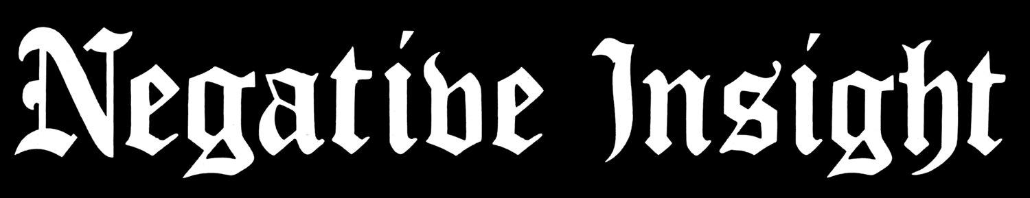
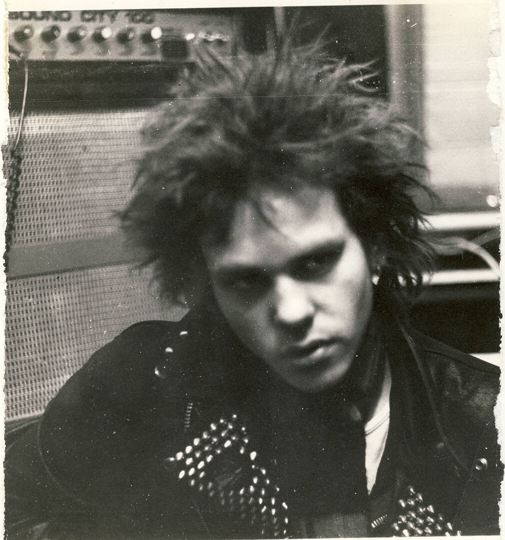
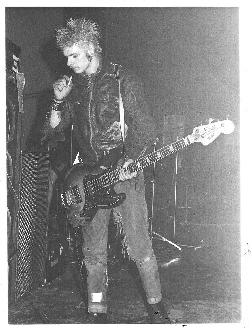
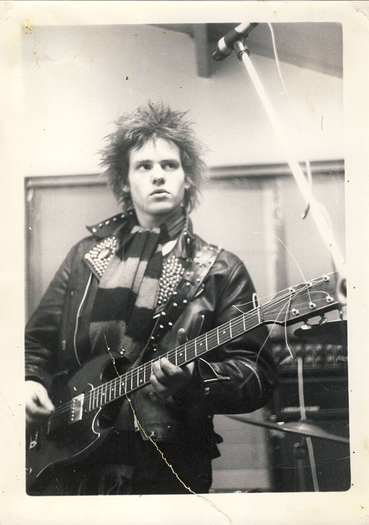
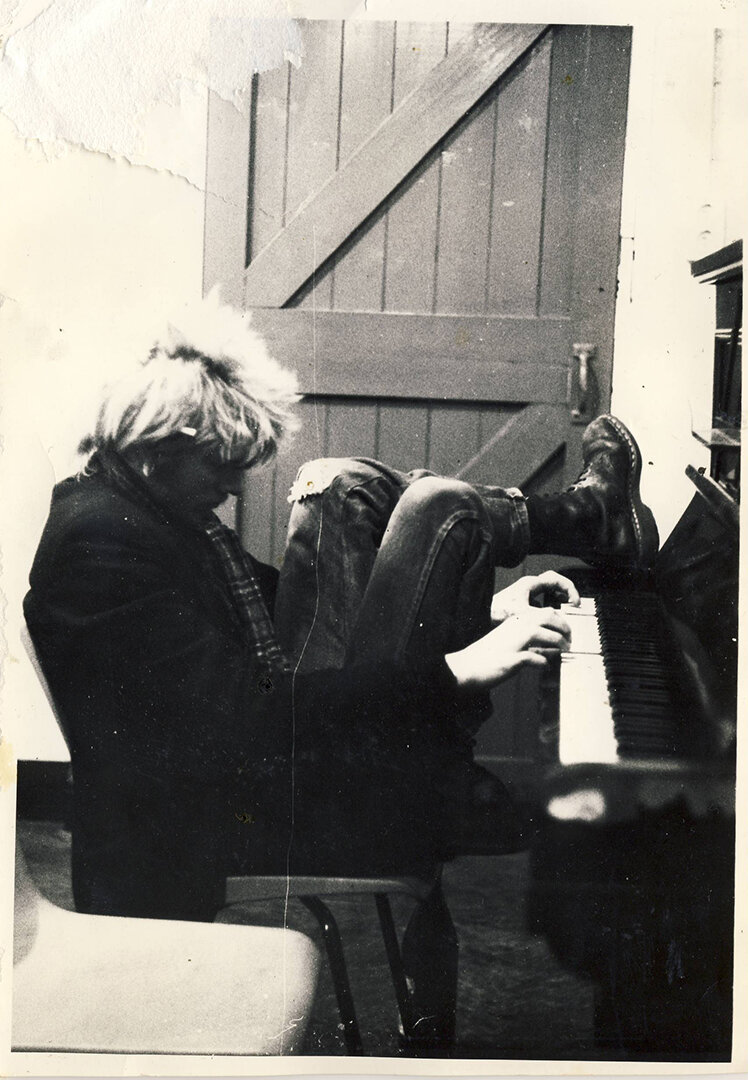
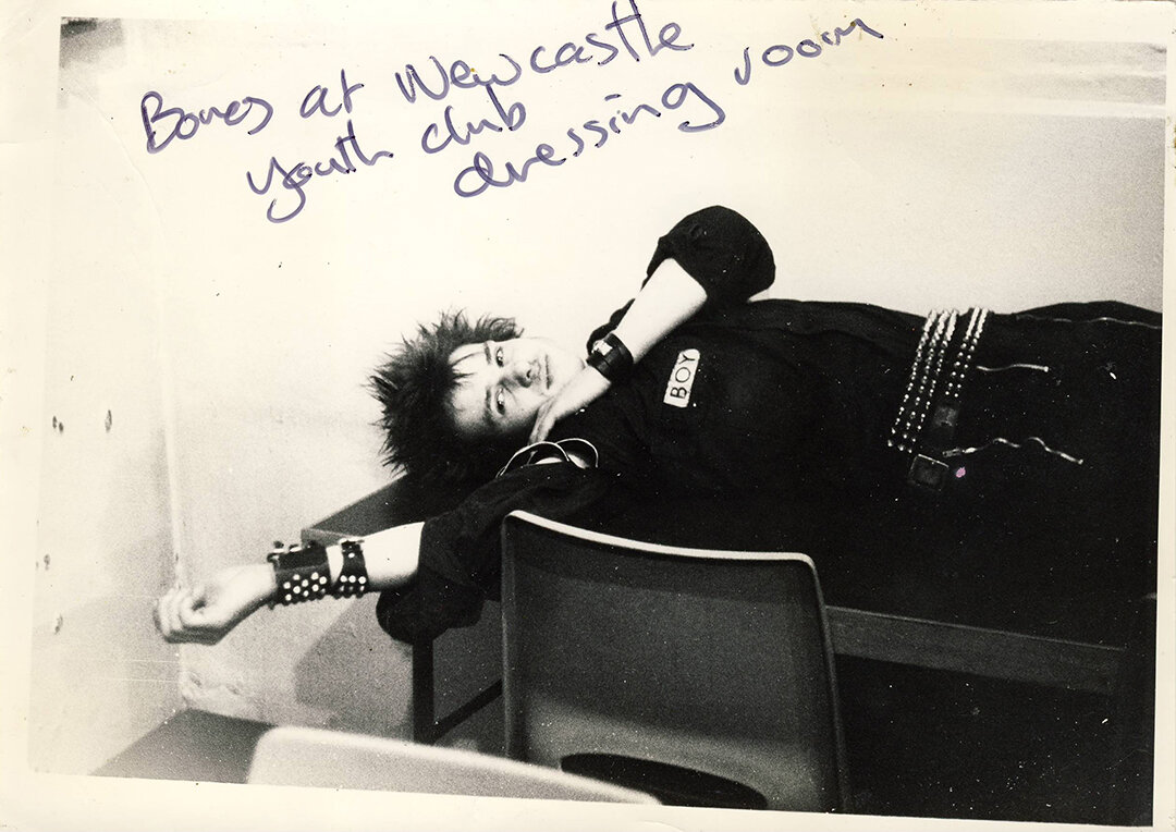
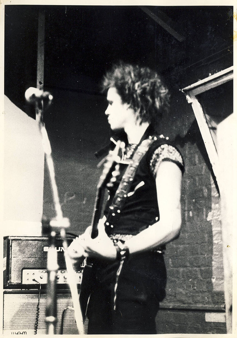
All photos, except where noted, taken by Martin and used with permission.
NI: What was your background with art? Had you gone to school for art, and who were your influences?
MH: I started a course in graphic design at North Staffordshire Polythechnic Stoke on Trent, the hometown of Discharge. After a year of the course, having met the kind of corporate minded people who ran design agencies, I decided I didn't want to be a part of it, so jumped courses into the Fine Art Department, specializing in print making. My influences then where at that time artists like Jamie Reid, who did The Sex Pistols "God Save The Queen" cover, and a lot of artwork that came out of the original punk movement. It was brash, and often used photographic images that were degraded, montaged or turned into work reminiscent of some of Warhol's prints. So silk screen printing was my thing for the next few years there.
Previous to then I was into the fantasy art of Roger Dean, who did covers for prog bangs like Yes, this was back in the pre punk days and it was what got me into drawing and creating in the first place.
NI: Were you influenced by anti-war art or anything from the Dada movement? What about the artwork of Gee Vaucher and Crass?
MH: Yeah, the Crass covers were, and still are, very powerful. Both the music and artwork of Crass were uncompromising and definitely had a huge influence on what I call the second wave of UK punk, from the '80s, Discharge being a big part of that. A lot of the original punk bands had become mainstream (The Clash), split or evolved into bands fueling the newly emerging Goth subculture, and playing big venues, so there wasn't a lot around for younger punks to get involved with.
Historically the best anti-war imagery in my view was from John Heartfield (1891 -1968). He was a German artist who back in the day was probably amongst the first to use of art as a political weapon. Some of his most famous photomontages were anti-Nazi and anti-fascist. Calvin almost exclusively used his artwork on subsequent singles and albums. I think it is important that people are aware of that, as I have read in in a few articles that they think that Calvin made the artwork himself. (After I did the single covers for Discharge, I taught Calvin Morris how to prepare artwork for printing, at the printmaking studio at my college)

John Heartfield, “Niemals wieder!” (1939)
NI: The "Realties of War" EP features the iconic photo of the fully studded jacket. What was your inspiration for this?
MH: The photo was one of a few that Mike Stone of Clay Records took. He had a record shop, he set up his label and eventually took Discharge on. I did a couple of covers for some of his bands, he was reluctant to do anything with Discharge at first because I don't think he really understood why they were (going to be) so important. At the time they hadn't even gigged, as Cal had just joined the band. I went to most of their rehearsals and pushed him to take a gamble, which thankfully he did.
Cal was averse to having his photo taken, he would often run out of the room if anyone tried to take a picture. In the end he compromised by having his back photographed!
At the time Discharge seemed to be the only band/group of punks that had so much metal on their jackets, the spikes on Cal's Jacket and the Discharge logo at the bottom (designed by Rainy) were a perfect , simple combination. I have always believed in getting things down to be as simple as possible.
NI: Was it intended to be a statement on the arrival of Discharge?
MH: Yes, I think it showed everything about what the new wave of punk was going to be, it could be seen on shelves in record shops from a distance, and punks would know immediately that this was going to be something else.
NI: Were there multiple ideas for the first EP? Did you take multiple photos for possible use?
MH: There were a few photos that were taken, and I can't remember if I asked Mike Stone to get specific shots of the jacket, till I got the one I wanted (he had a better camera than mine, and he was a photographer).
NI: Are you surprised by how iconic it has become?
MH: I suppose I am, and after it came out, it was mad seeing the fan base grow, with more and more punks getting heavily studded up in the clothing. I am more surprised on how the three skull logo I designed became so massive. There's a story about that and I’ll do that at the end.

Discharge – Fight Back EP (Clay Records, 1980)
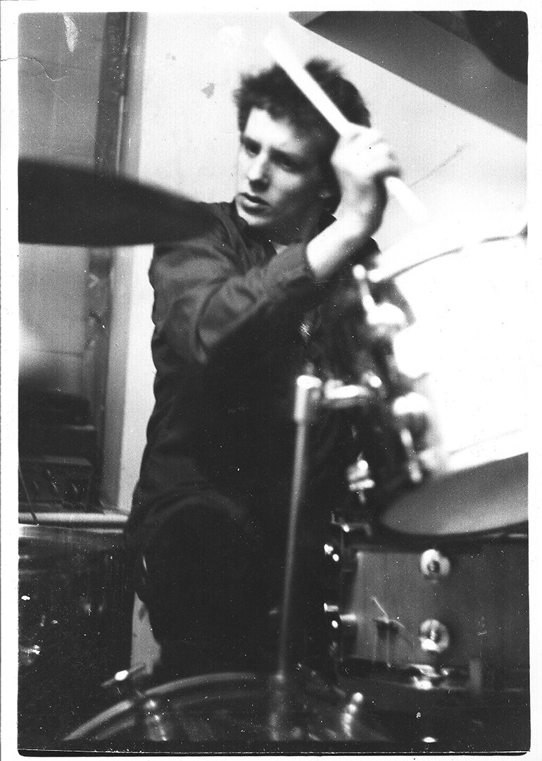
NI: The "Fight Back" EP featured a live photo of the band. What were your thoughts when designing this? Why did you choose a live photo? You also used high contrast black and white on both "Realities of War" and "Fight Back." What inspired this, and can you discuss the purpose of the high contrast? Did you try it out as not high contrast?
MH: That photo was very blurred due to shutter speed and light, but it had an urgency and energy to it. In keeping with the cover of "Realities of War," I wanted to keep it black and white. Without computers back in those days everything I did was trial and error in the dark room, eventually it came out as I hoped, slightly abstract, but still I think, full of energy, and representing something of what it would be like to see them live.
NI: The final Discharge cover you designed was the "Decontrol" single, which used a collage technique. What made you try this? Were there any specific record covers that inspired it?
MH: There were no specific covers that inspired me, but overall, the use of montage in punk related artwork was still prevalent, so it made sense to me to attempt it. I had a lot of material then from photos of the band playing, which again shows people how dynamic their gigs were (still are!)
I had an idea to do a depiction of a room with a simple black and white pen drawing a TV in the corner of a room, with some bland image on the screen, or maybe a word like 'obey' (I can't remember if the John Carpenter film They Live was out then or not). But the wall would be a montage of Discharge, as it is in the final version. The idea was to show that people are trapped and stuck because that’s what the media and governments are all about, but while you are sat at home consuming TV, there's other crucial stuff happening 'outside' i.e. being at gigs). I ran that idea by the band, but they preferred just a montage, so that's what I did.
NI: What are your thoughts on how ubiquitous collages on punk covers have become?
MH: I think it's great, it keeps to the punk ethos of being able to create without being an expert, it's the equivalent of Mark Perry saying, "Here's three chords, now go and form a band."
NI: The Discharge "three skulls" design, which was later used on the "The Price Of Silence" single in 1983, is often the first image people associate with Discharge outside of the logo. It is also something that’s been worn by Metallica, Anthrax, and countless others. How did you come up with this design?
MH: The story of the three skull design, which is still being used as the backdrop for their gigs; it has been used on one of their singles, bootlegged on teeshirts for years, and also re-purposed by other bands where they take the Discharge name off and put their own in. I would say that this design has become a significant icon, I've seen a lot of people with it as tattoos also.
This came about when Tezz asked me to design a new logo for the band, he wanted a cross between the classic Death or Glory belt buckle and Motörhead’s logo. So I created the three skulls with shells design.
I've heard that some people think that Rainy designed it, but it was something I did entirely independently, in discussion with Tezz. So I just wanted to clear that up!

Original Discharge "three skulls" logo drawn by Martin H.
NI: What are your thoughts on having permanently impacted the punk aesthetic?
MH: It has taken a while for me to realize that this has been the case. I am very happy that I have been a part of that, but it is in the context have having been friends with the band and really believing strongly in what they were doing. I think I got them and was able to create the initial artwork that was in tune with them as a band.
NI: Why did you stop working with Discharge, and do you have any Discharge cover designs that went unused?
MH: Around 1982 I left Stoke on Trent for London, to form my own band, and I lost touch with them. Wouldn't happen nowadays with Facebook, email, etc. Then I saw that they were going to play down here in the south west (I moved from London to Plymouth), not far from me so I met up with them. That was something special, after all these years. I may well do more work with them as Jeff is keen to get my input back in again, which I’m up for of course.
NI: Were there any other punk bands or covers that you did the design work for?
MH: No punk bands. I did a cover for another electronic band that were on Clay Records, Plastic Idols, but I wasn't happy with it as the singer kept wanting it altered. I did what he asked but it wasn't very good, and an album for a prog band that was on Clay, called Grace.
NI: Any final thoughts on your designs or the way they are remembered?
MH: I guess I am very happy that not only are the covers still appreciated, but the band is back on form, with Jeff on vocals. If I was to do any more covers I'd still do a lot by hand, despite being able to create artwork on computers now.
Also as a side note, in Tezz's book, But After The Gig, he gets my name wrong, calls me Martin Edwards, (it was a long time ago) so the bit where he refers to someone mopping Calvin’s sick up before Bono goes on stage, that was me!

Martin H. with Discharge today.